Revivify is the simplest spell in D&D to return the dead to life. I’m not restyling CSS or changing my site-generation, so this seemed appropriate.
I recently had a friend come across my blog, and was promptly shamed for having a certificate more out of date than the VCR. Such an embarrassment couldn’t rest, and so I cleaned up my act a bit. It turned out to be easier than ever to setup certificates, as gitlab added an automatic letsencrypt integration. No more manual process, no manually proving your identity.
Auto Let’s Encrypt
All I had to do was to go remove my old, defunct certificates and throw a
toggle button to enable the auto-letsencrypt feature. When done manually you
reach out to letsencrypt, and they give you a UUID:KEY pair. You put up a
page at, say, mysite.com/.well-known/UUID, with the KEY as it’s content.
Then, you let letsencrypt know it’s up, they see the key, and send you a cert
for 90 days. Presumably, the automatic integration monitors the certificates
lifetime, and when it’s close to expiry they get a new UUID:KEY pair, prove
the site’s administered by them, then update the certificate.
A nice feature, for a someone with no time to be updating a certificate every 90 days.
Cosmetic Fixup
I also fixed up a few cosmetic problems with the site. The repo button was broken and mentioned github rather than gitlab. I fixed up the text and grabbed an icon from the gitlab press kit, but the icon was blowing out the alignment of the text.
After some consulting the oracle (stack overflow) the suggestion came to use a flex container. More alignment directives are available to their contents. It’s not the first time I’d seen flex containers, some CSS frameworks work in terms of flexible rows of elements, so it was familiar. That mostly worked, but making the button a flex element stretched it to the width of the page. Whoops.
What went wrong was that display: flex; can either declare something a flex
container or flex element. It may be that isn’t a real distinction, and any
flex element can be a container to an element inside it. Declaring the section
containing the button as flex led to the button (now an element relative to
an outer container) to only take up as much space as it needed. And the CSS
directives to align text worked! Happy day.
Archiving Old Content
I created a “past ‘About Me’s” page, as I figured it’d give context to how my identity has changed over time. I also created a “past MoTD” page to capture the same thing for the descriptions in my site’s header. I think I’ll move to those being quotes I empathize with rather than some attempt to be quippy.
Conclusion
Anyway, that’s all I’ve got. I learned a bunch of interesting architectural details about castles from a cool youtube channel, Shadiversity. I’d highly recommend it for anyone interested (especially those bored during the COVID-19 quarantine).
A quick demo, you know how most castle / tower battlements look like this?

The alternating blocks up top are called merlons, the gaps between crenels, the two together are crenelations, and provide alternating full and half cover to defenders. This making it extremely difficult to hit a defender with an arrow. However, the crenelations make it difficult to hit an assaulting force close to the wall. Defenders would have to lean over their defenses, exposing themselves (and toppling over, if they were a clutz).
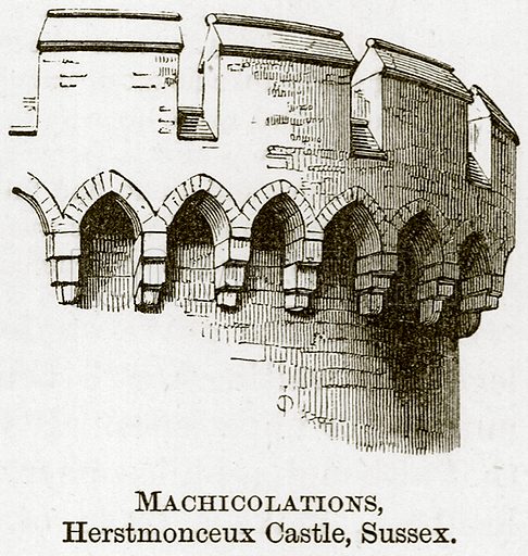
This failing is addressed by offsetting the crenelations from the wall, supported by large blocks of stone called corbels. These blocks extend from the wall, and form the arches you see in the above image. The gaps between the corbels are called machicolations, and defenders could drop stones, hot sand, boiling water, and other nasty things through.
I think his channel’s awesome, you should check him out!

